
Hand to Hand
DESIGN CHALLENGE
Founded in the incubator of Downtown Detroit, Hand to Hand - a food delivery service - specialized in connecting local eateries with local customers. While most food delivery services (e.g., GrubHub, Uber Eats, DoorDash) focus on providing customers an endless array of food options, HtH specialized in supporting and cultivating local business by limiting options specifically to locally-owned, locally-operated restaurants and independent eateries.
As a new service, the startup needed to develop main pages of it's future-state mobile application. Starting fresh, the options were endless - from layout and structure, to color and possible features. I conducted preliminary research with potential users to form the skeleton of what would become the foundation for subsequent app pages, leveraging familiar aesthetic principles with clean, clear, effortless design.
11 pages
2 months
200+ participants
Goals
To craft an initial design and operational skeleton that:
-
Was familiar to users of similar applications while remaining unique and distinguishable
-
Drove user engagement to specific call-to-action areas
-
Leveraged "clean" design to reduce mental processing during food searching/ordering processes
-
Validated design and high level functionality with user groups - to inform future decision making
Purpose
Utilize data, user input, and creativity to develop designs that were both aesthetically pleasing while highly functional - connecting local users with local businesses to spur Detroit's economic development.
Research & Insights
SURVEY, MARKET & USER RESEARCH
Prior to the project, HtH conducted a number of user surveys. Users were pulled primarily from the metro Detroit region, with special emphasis on restaurants and establishments located specifically in the city. Users could be located outside of the city (and place an order), but it was critical that the physical location where the food originated from was located in the city.
Combined with this initial research, I then supplemented the data by examining the food delivery market (nationally, regionally, and locally), along with potential competitor groups and peer sets.
This combined grouping of data was then categorized into primary themes across; visual design, information, interface, and data categories, before initial designs were developed.
VISUAL DESIGN
INFORMATION
INTERFACE
DATA


User Groups
IDENTIFICATION
With a food delivery and service application, all users within a region are potential customers. Given HtH's lean towards locally operated bars, restaurants, and eateries, it was important to narrow down which specific regions would fit the tentative "user base." Metro Detroit's population contains more than 4,000,000 people. It is a bustling interconnected web of urban and suburban areas, towns, cities, and metropolitan districts. Within this metro area, four "user regions" were identified, each within a 10 mile radius of one another.

Stretch Users
At a distance of roughly 30 miles from downtown, users within this area sparsely traveled to Detroit specifically for food. Instead, groups in this region traveled to the city for primary reasons: a sporting event, art museum, or concert - and then, while in the city, secondarily pursued local restaurants for food.
Secondary Core
The secondary core of users were identified as rougly 5- 10 miles outside of downtown; placing them within driveable or public transit distance from HtH home-base. Users from within this region regularly traveled downtown to enjoy food, culture, or the arts.
The Outliers
Detroit's international sister city is Windsor, Ontario. Each day, tens of thousands of people cross the Detroit River via the Ambassador Bridge - for work, for play, for food. While these users were not a primary group, they were still targeted as potential future customers.
The Nice to Have's
Approximately 20 miles from downtown, this region of metro Detroit was identified as up and coming, filled with young professionals, bars, restaurants, and new businesses. Users from this region sometimes traveled to Detroit to eat or enjoy nightlife, but would typically stay within their region given current options.
Ground Zero
Groups of users representing the core demographic of HtH - centrally and locally living and working within the city of Detroit. Users within this region provided a mutual, symbiotic service-relationship between customer and business.
Prototypes

SKETCHES, IDEATION & CONCEPTION
Beginning with a blank slate left room for experimentation, iteration, and reiteration. Multiple design influences were taken into consideration, from layout and structure, to colors, contrast, sizing, and positioning. Research and conversations with potential users highlighted the need for a distinct color palette, high contrast areas (particularly with calls to action and purchase pages), and a balancing act between providing enough information to inform users, but not enough so as to lead to cognitive fatigue.


LANDING & HOMEPAGE
HtH wanted something unique, something eye-catching, not fitting the traditional landing page of food and food delivery applications. Individual letters, coalescing to form "Hand to Hand" would be the first page users would see when downloading the app. After a few seconds, the main home page would appear, prompting users to tap a singular button to enter the app. Modern, clean, simple was the goal.
It was essential the first few pages:
-
Establish a unique, memorable, and recognizable brand among new users and customers
-
Require minimal interaction by the user - more watching and observing, less cognitive processing
-
A modern, clean design free from unnecessary wording, iconography, or graphics
-
A welcome/loading page immediately sending the user to their personalized dashboard (not prototyped)

H
a
n
d
t
o
H
a
d
n

SIGN UP/LOGIN
Keeping in line with simplicity, the sign up/login page was kept deliberately refined. Again, to minimize cognitive fatigue and processing. When people are hungry, patience is low - there was no need to overly complicate the sign in or sign up page, nor incorporate unnecessary design elements which could distract the user from their intended goal. Future users of the app were allowed to sign up via a few finger taps through common social media platforms.

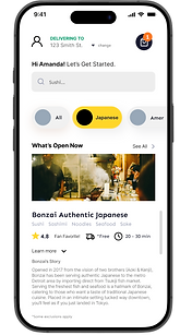
HOMEPAGE & SEARCH
Instead of reinventing familiar patterns, the user homepage and search pages were designed to align with the standards of popular food delivery apps, ensuring ease of use and intuitive navigation. To reinforce HtH’s Detroit-centric mission, subtle messaging like “Let’s eat local” was integrated into key screens, creating a sense of community and place.
Given this local focus, additional content was added to help users:
a) Learn more about each establishment
b) Explore available menu options
c) Connect with the neighborhood feel
Beneath each restaurant listing, short personalized descriptions—called “stories”—offered a glimpse into the people and passion behind the food.
Search pages prioritized local restaurants by popularity and cuisine type. The layout mirrored the familiar structure of leading food apps, keeping the browsing experience straightforward and user-friendly—delivering exactly what users expect, in the way they expect it.


ORDER & PAYMENT
Survey data highlighted three fundamental, must-have components of the order review and payment page:
1) Identification of order status (e.g., items, review, modification)
2) Ability to track in real time the anticipated delivery (in minutes)
3) Ability to see who (which driver), is handling and delivering the food


ACCOUNT MANAGEMENT
When things go wrong, users don't want to fumble with a clunky account management page. Following a clean, monochromatic design with recognizable icons and chevron go-to-buttons, the account management page was kept as direct as possible - meant to guide users where they need to go to make modifications to their account, view past orders, change financial information, or get help. While these specific pages were not design requirement at this time, they did open the door for extrapolating on these account management areas in future research and design sessions.

Style Guide
Brand
Type
Colors
Orange
#FF7622
Controls
Icons
Green
#15A479
White
#FFFFFF
Black
#000000
HtH
Yellow I
#EBC526
Yellow II
#FED62B
Light Grey
#F0F5FA
The application design adopted a clean, intuitive layout consistent with industry standards, making it instantly familiar to users. A cohesive color palette based on adjacent hues was used, with strategic pops of color highlighting interactive elements, such as user input fields and order modifications. Key call-to-action areas—like progressing to the next screen or placing an order—were emphasized with bold, high-contrast accents to draw attention.
User research confirmed the obvious: people using food delivery apps are often hungry, which significantly reduces their patience. In this state, users aren’t interested in exploring or figuring things out—they want to order quickly and eat as soon as possible.
With that in mind, I designed a straightforward, calming interface that minimizes cognitive load. The goal was to create an experience that feels immediately approachable—easy to navigate, quick to understand, and visually clear.

Testing & Outcomes

96%
of polled users found overall design of the application to be easy, or very easy to follow, understand, and interpret. (n = 192)
89%
of polled users remarked how, based on design, layout, structure, and format - that the application is something they would likely or very likely use. (n = 192)
"It seems like this app already exists. The way it's designed and laid out resembles something I have seen before. It's not confusing or showing me a ton of information I probably wouldn't need. I like it." - John G., Detroit
"Based on first glance, it all looks really straightforward. I'm not sure what the other pages will look like in the future, but based on these designs I don't see anything that would cause me confusion." - Emily L., Ferndale
"I like the concept of showing me restaurants exclusive to the area, so there's a mutual benefit. The area with more information is helpful since these places aren't chain restaurants...we (the customers) would need information like that before choosing a place to eat." Matt H., Rochester Hills