


DESIGN CHALLENGE
Papermates, a digital paper and essay editing service, needed to leverage user feedback gathered through interviews, focus groups, and competitive market analyses - to develop high-fidelity landing, home, sign up, and product pages for their mobile application.
17 screens
2 months
100+ participants
Goals
Utilize user feedback and market data to build a cohesive, user-friendly design that:
-
Is recognizable and memorable among similar applications, while also consistent within it's class
-
Drives and increases user engagement, specifically to call-to-action areas
-
Leverages "clean" design to reduce cognitive load during selection and choice processes
-
Validates the concept and drives future design and product/service initiatives
Purpose
Put data into action and serve as a design springboard for all future page ideations and serve as the "face" of Papermates.
Research & Insights
THEMATIC CODING
Prior to the project, Papermates conducted multiple surveys, interviews, and focus groups with targeted users (K-12 & college/university students). I supplemented this internal research by examining market and competitor paper editing services. Data was then categorized into primary themes across; visual design, information, interface, and data categories, before being implemented into design pages.

INTERFACE
VISUAL DESIGN
INFORMATION
DATA

User Profiles
DEFINING GROUPS
Through existing research, user, market, and competitor data analysis confirmed two primary user groups (high school & college/university) and one secondary group (the general public). Honing in on these specific groups helped supplement my design process by refining and adding clarity to what these target demographic users need, want, or desire with this type of interface and design.
While technically anyone could use the service, it was important to establish some parameters around specific user groups - to design the interface, create content, and incorporate language that would resonate most closely with and across these groups.
High School
College
Public
Information Architecture
Ease of use
By thoroughly reviewing existing and supplemental data, I gathered a deeper understanding of how content and information architecture should flow - to minimize user error and frustration while maximizing efficiency and driving calls to action. Results produced a hierarchy and structure that was logical, flowed without heavy cognitive input, and mimicked similar applications.
Immediately recognizable
Research showed that groups within these age ranges commonly interacted with applications (e.g., food, dating, transportation), following simple, step-by-step processes with minimal distractions and unnecessary "fluff." It was paramount to create a design and user flow in line with similar applications to instantly build app familiarity (even if the user was new) - while also utilizing high contrast colors to differentiate and steer users towards key actions (e.g., sign up, select service).


Prototypes
LOW FIDELITY

Low-fidelity sketches and back-of-napkin ideation sessions distilled the design into simple, yet effective mobile, menu, and, page architectures. Sketching helped refine the process on-the-fly, and led to rapidly developing high-fidelity prototypes to get in front of target users and gather feedback.


HIGH FIDELITY
Following initial sketches, high-fidelity prototyping was produced, modified, and tested in Figma. Further research via usability testing with select users within the platform through interactive design sessions helped to flush out existing and potential pain points, as well as focus on key areas of the design that truly resonated across user groups.
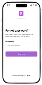
WELCOME, SIGN UP & VERIFICATION
Through usability and survey research, data showed it was absolutely critical to limit the amount of steps a user would need to take to sign up for the service. Patience was low and instant gratification was high - so I aimed to keep first impressions short-and-sweet, distilling only necessary information to four essential pages:
-
A welcome page allowing users to immediately see plans and pricing, continue with setup, or log in
-
A simple sign up page with the ability to auto-fill from other platforms, skip, or login to account
-
A simple verification and authentication process
-
A welcome/loading page immediately sending the user to their personalized dashboard (not prototyped)


DEMOGRAPHICS & SERVICE RECOMMENDATION
Since it was presumed the service would be used by a relatively small subset of possible users (e.g., high school/college students), I recommended implemented a number of demographic pages to collect relevant data. Doing so helped Papermates pinpoint who the key users were, their age, gender, and educational status - all to be used to develop, test, and implement more efficient, better products and services both now and in the future.


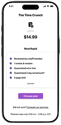
SERVICE OPTIONS & PAYMENT
Papermates followed a common subscription based model, which meant these pages had to be familiar with users. Similar to common dating, transportation, or food apps, formatting service sign up pages in a manner that was instantly recognizable to target users was critical. I opted to distill each service (from largest to smallest), into four identical pages so as to allow the user to quickly and efficiently select a service - tied together with high contrast call-to-action buttons.
The goal was to drive conversions, not look pretty. (Well, maybe a little pretty).


Style Guide
Brand

Type
Colors
Purple
#B257E7
Lilac
#F1F6F7
White
#FFFFFF
Controls
Icons
Black
#000000
Application style followed a simple, refined, and easily recognizable layout. Colors were kept predominately monochromatic to minimize unnecessary visual distractions, while important call-to-action areas were highlighted with colorful, high contrast (in this case rich purple) - drawing in the user.
Research indicated users who would use the app often experience a present or existing high cognitive load (e.g., working on a paper, reading, editing, etc). Essentially, users seeking this service were already stressed - the last thing they wanted was an application designed to help them, add to that stress.
With this in mind, I opted to create a simple, yet calming/positive layout to reduce cognitive load entering the app, and to establish an immediate relatability with ease of use, navigability, and readability.

Testing & Outcomes
91%
of users found app sign up, login, and get started pages either easy or very easy to use through clickable usability and prototype testing. (n = 23)
96%
of users found the overall design, recognizability, and navigability of the app easy or very easy to follow. (n = 112)
90%
of users reported they would recommend the application to a friend or colleague based solely on ease of use, design, and feel. (n = 112)